5. Button Behaviors
In this project, we’ll look at button states like hover, pressed, and clicked, as well as how buttons can be used to provide users with control over states of other elements of our programs. This project continues to emphasize the use of functions to create modular code. In a future version of this project, we’ll create object-oriented buttons. As this project shows, it is helpful to think of buttons as having different behaviors such as display color depending on their current state and user interaction. It is instructive to consider how a button differs from a simple rectangle, code written for the button directly relates to the behaviors and functions of a button when contrasted with a simple rectangle.
Below is one possible way we could describe or model the features of a button:
- Function:
- Indicate and allow change of State for some system variable
- Behaviors:
- Default, Hover, MousePressed, MouseClicked
- Structure:
- Square defines activation area
- Circle fill and stroke changes to indicate behavior and state
- Position is defined with x,y coordinates on the canvas
- Size is defined by some width and height values
Here, we will use global variables to maintain these button states, yet intuitively, it would make sense that the button display state information should only be used within the code to display the button.
In the code below, we create a very simple program with 2 rectangles to explore how to design a button. We want the button to respond to the user’s mouse when the mouse interacts with the button’s rectangular area to give the user indication that the button is interactive. We will have 2 types of dynamic behavior in this project, one set of behaviors relate to how the button rectangle and circle change with mouse interaction. Then, we need to have the button change the state of the blue rectangle, using the global state variable rectState
int rectState=1;  //state variable to control fill color of rectangle

void setup(){
        size(250,150);
}

void draw(){
        background(255);
        switch(rectState){
        case 0:
                fill(0,0,255);  //blue
                break;
        case 1:
                fill(150, 150,250);  //light blue
                break;
                default:
                        fill(100);  // if neither state, have a gray rectangle
                        break;
        }
        rect(10,10,100,100);  // draw rectangle which will be controlled by button
        drawButton(150,40,50,50);
}

void drawButton(float xPos, float yPos, float bWidth, float bHeight){
        fill(100);
        stroke(20);
        strokeWeight(3);
        rect(xPos,yPos,bWidth,bHeight);
        fill(255,0,0);
        ellipse(xPos+25,yPos+25,bWidth-5,bHeight-5);
}
The switch statement provides a variation on the conditional branching structure, we could use if(), else, but for some situations, switch provides a cleaner, simpler structure.
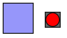
Our code currently creates this program display where the button will control changing the color of the light blue rectangle:
5.1. MouseOver
Now we need to create code that will respond to a user’s mouse being over the rectangle, so let’s create a function to test if the mouse is over the button. The function input parameters will be the button’s position and shape, we want to have it return a boolean true or false value
boolean isMouseOver(float xPos, float yPos, float bWidth, float bHeight){
     if(mouseX> xPos && mouseX < xPos + bWidth && mouseY > yPos && mouseY < yPos+bHeight){
                        return true;
        }
        return false;
}
5.2. Responsive Button
Now we need to use our isMouseOver function to add some interaction feedback to the user. We will consider 4 different states of our button where we will design our button to have toggle behavior, this means that it changes state from active to default every time the user clicks on it:
- default: button is inactive
- red
fillcircle and blackstrokeoutline
- hover: the mouse is over the button, but not pressed or clicked
- red
fillcircle and whitestrokeoutline
- pressed: the mouse is over the button and is being pressed
-dull green
fillcircle and whitestrokeoutline
- clicked: the user clicked on the button to put it in the active state.
-bright green
fillcircle and whitestrokeoutline
5.3. Mouse Event Handlers
We can use nested if blocks and the isMouseOver function to add this logic to the drawButton function. First, we’ll want to define a variable that we can use to track the buttonState as _btnActive. Since this value will be used in the draw loop and needs to have be initialized in the setup() function, we will make it a global variable. Similarly logic can be used to justify creating a global varialbe _btnHover that will be used to track whether the user’s mouse is over the button. We can use this variable in the mouseClicked function to determine if the button state should be modified by the mouse-click. The following code is part of the drawButton() function and controls the coloring of the button circle as identified above.
// inside drawButton() function

_btnHover=isMouseOver(xPos,yPos,bWidth,bHeight);

if(_btnHover){
        stroke(255);    //white outline
        if(mousePressed){
                fill(160,200,0);        //dull green
        }
}

if(_btnActive){
        fill(100,200,0);        //green
        stroke(255);
}

ellipse(xPos+25,yPos+25,bWidth-5,bHeight-5);  //draw the button's circle with fill that was executed
5.4. MouseClicked
We also need to create the code to toggle the state of _btnActive when it the mouse is clicked and the mouse is located directly over the button. We can use the global variable _btnHover as an initial conditional check to determine if any action needs to be executed, otherwise, the user has clicked outside of the button area.:
void mouseClicked(){
  if(_btnHover){  //only change btnState if the user is over the button when clicking
      if(_btnActive){
          _btnActive=false;
          rectState=1;
      }
      else {
          _btnActive=true;
          rectState=0;
      }
  }
}
Here is the processing sketch:
Below is the full code to create a responsive button that controls the behavior of a separate rectangle.:
int rectState=1;
  boolean _btnActive=false;
  boolean _btnHover=false;

  void setup(){
    size(250,150);
  }

  void draw(){
      background(255);
      switch(rectState){
        case 0:
           fill(0,0,255);  //bright blue when button is active
           break;
        case 1:
          fill(150, 150,250);  //light blue when button is off
          break;
      default:
        fill(100);  // if neither state, have a gray rectangle
        break;
    }
    stroke(20);
    rect(10,10,100,100);  // draw rectangle which will be controlled by button
    drawButton(150,40,50,50);
  }


void drawButton(float xPos, float yPos, float bWidth, float bHeight){
      fill(100);
      stroke(20);
      strokeWeight(3);
      rect(xPos,yPos,bWidth,bHeight);
      fill(255,0,0);

      _btnHover=isMouseOver(xPos,yPos,bWidth,bHeight);
      if(_btnHover){
        stroke(255);  //white outline
        if(mousePressed){
          fill(160,200,0); //dull green
        }
       }
       if(_btnActive){
          fill(100,200,0);  //green
          stroke(255);
       }
      ellipse(xPos+25,yPos+25,bWidth-5,bHeight-5);
 }

boolean isMouseOver(float xPos, float yPos, float bWidth, float bHeight){
       if(mouseX> xPos && mouseX < xPos + bWidth && mouseY > yPos && mouseY < yPos+bHeight){
        return true;
    }
    return false;
}

void mouseClicked(){
  if(_btnHover){  //only change btnState if the user is over the button when clicking
      if(_btnActive){
          _btnActive=false;
          rectState=1;
      }
      else {
          _btnActive=true;
          rectState=0;
      }
  }
}